Journal entry
NovelAI Powered Landing Page Redesign
For this blog post we wanted to take a moment to showcase some of the latest visual updates to our landing page and share some of the thoughts and the NovelAI powered design process behind it and hopefully, even inspire you!
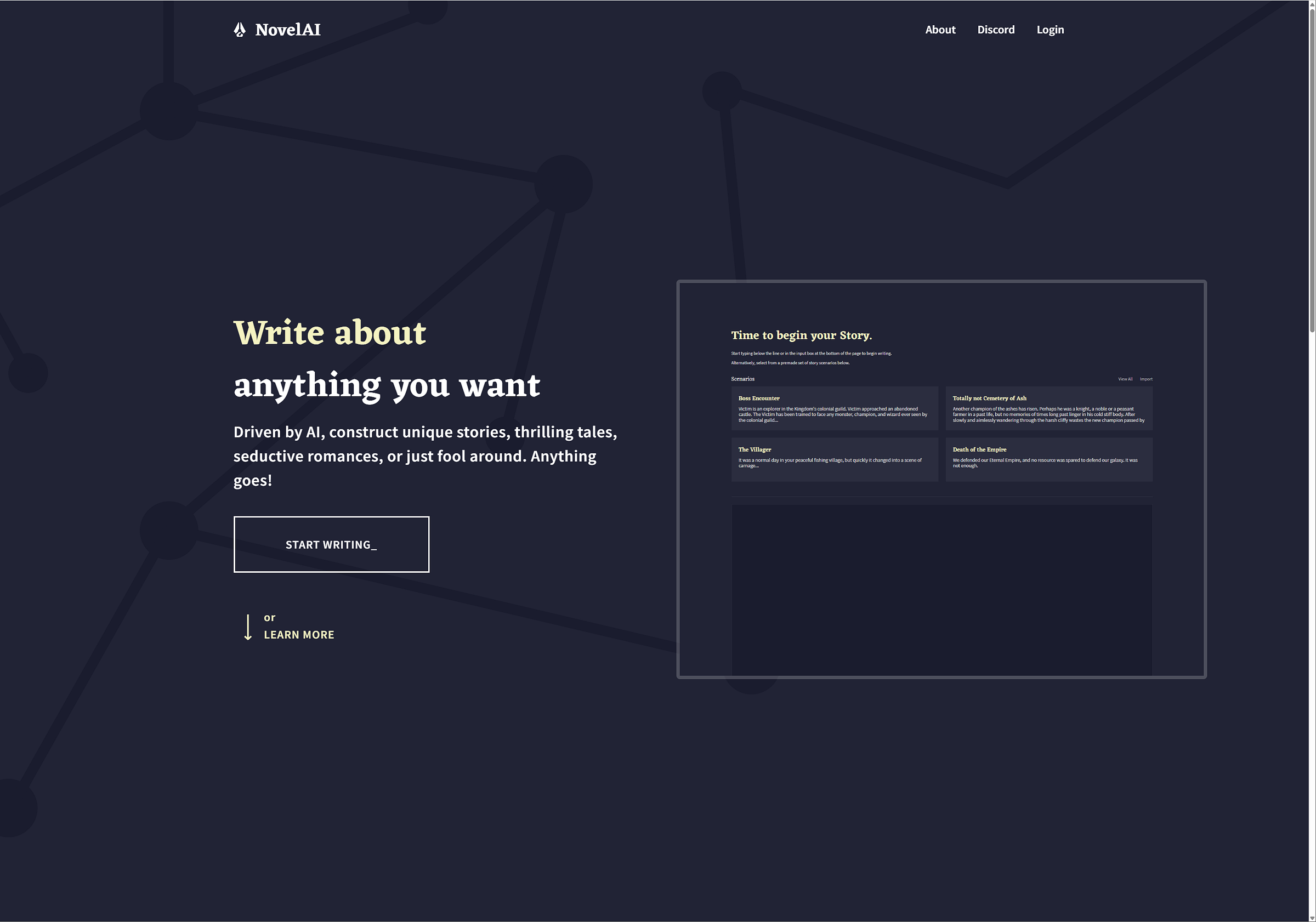
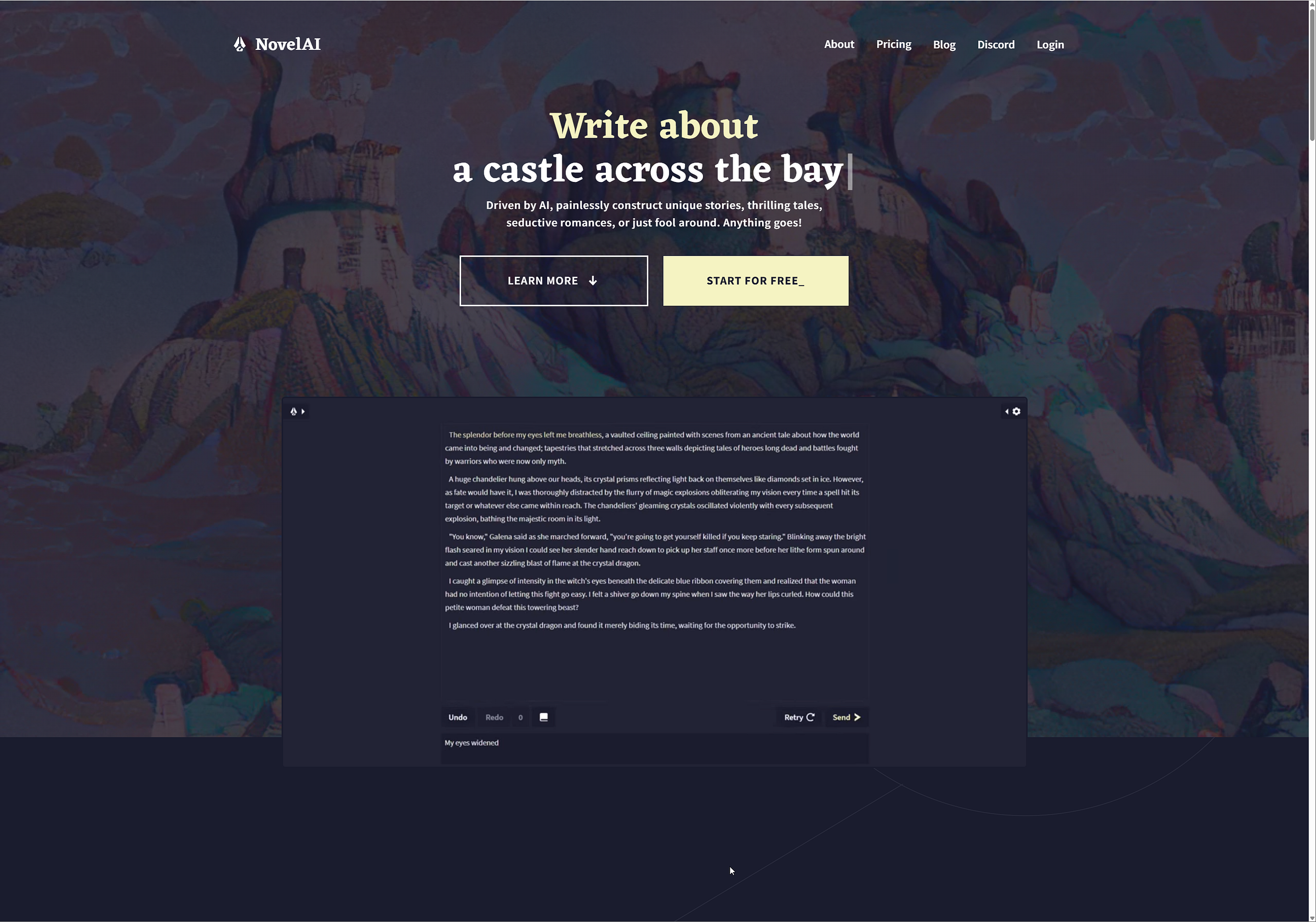
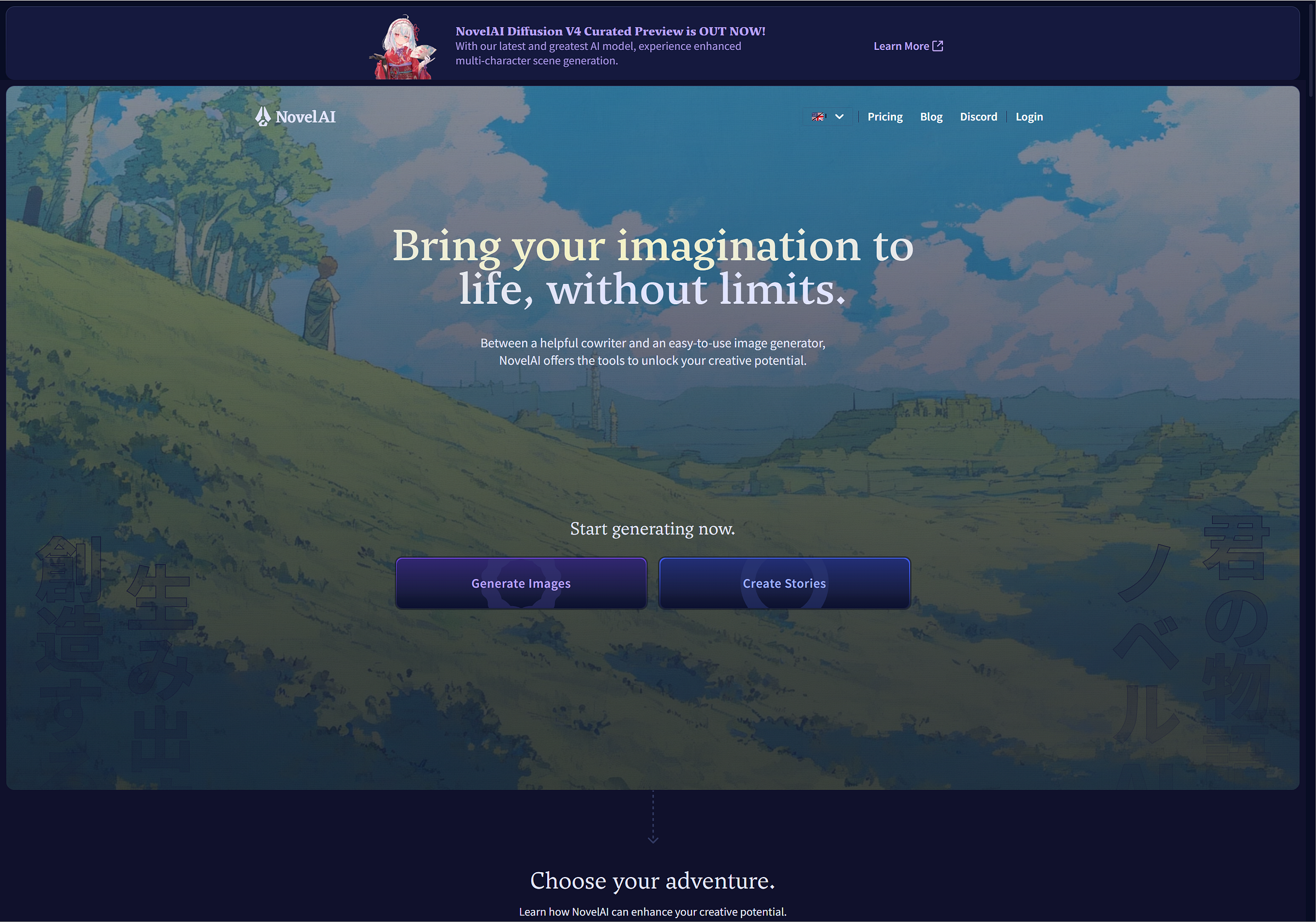
Our older users may remember the original navy blue landing page, or the adventure themed ones, welcoming you with a variety of landscape visuals, created with our earlier AI image generation models. The text copy that introduced you to NovelAI also didn’t quite convey what we offer up as well, it heavily focused on text generation, without a mere mention of Image Generation unless you proceeded further into the site. We even had a few cases of people coming in for image gen, and thinking they landed in the wrong spot!
So clearly, we had to think of something to better convey what we offer, while representing the capabilities of our service.
Naturally, we needed to bring out the anime generation whilst not leaving text generation behind.
Here we stumbled into the next problem, how would you convey text generation without just showcasing a wall of text? In the past we aimed for inspirational images, landscapes of adventures you could go on in fantastical worlds and such, no text or subjects that can run the risk of clashing with any foreground elements.
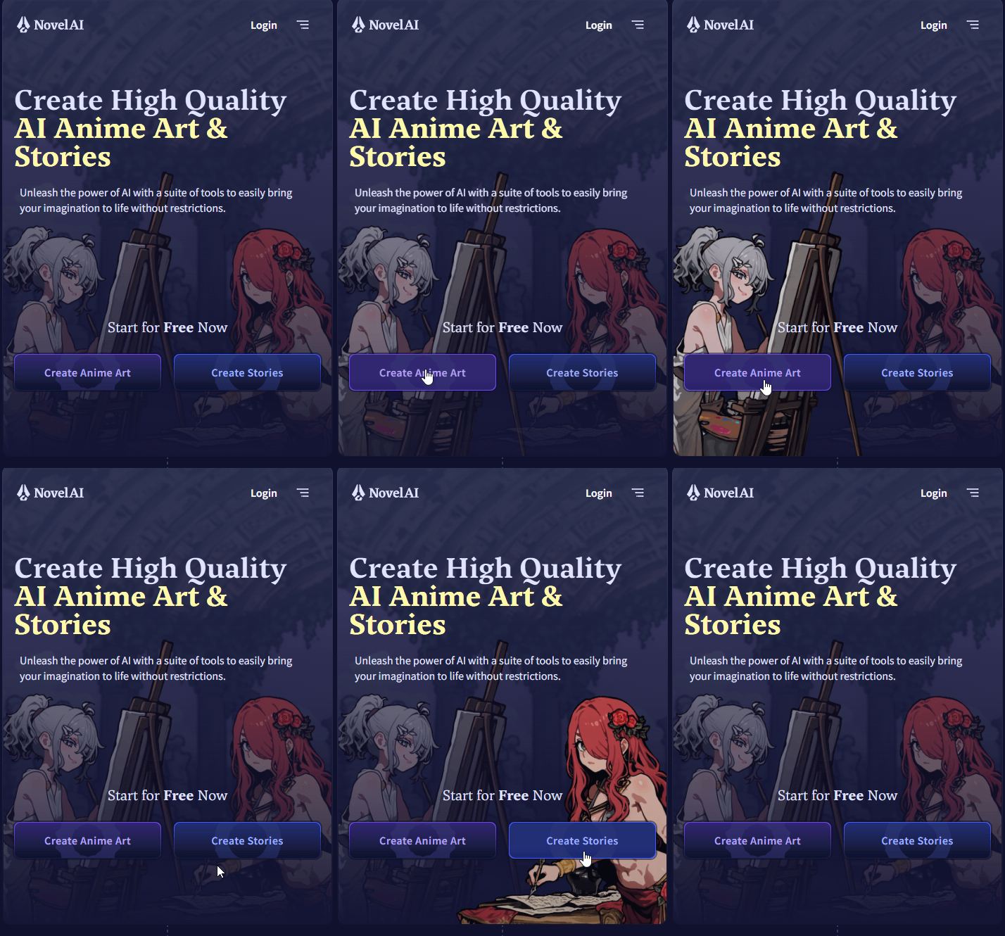
Our first draft headed for an anime girl (rightfully so, that’s exactly what a big group of our user-base goes for!) that both showcases writing and drawing. We chose Nai-chan our ever-handy image-gen mascot as the subject and thought of having her magically work with both images & text.
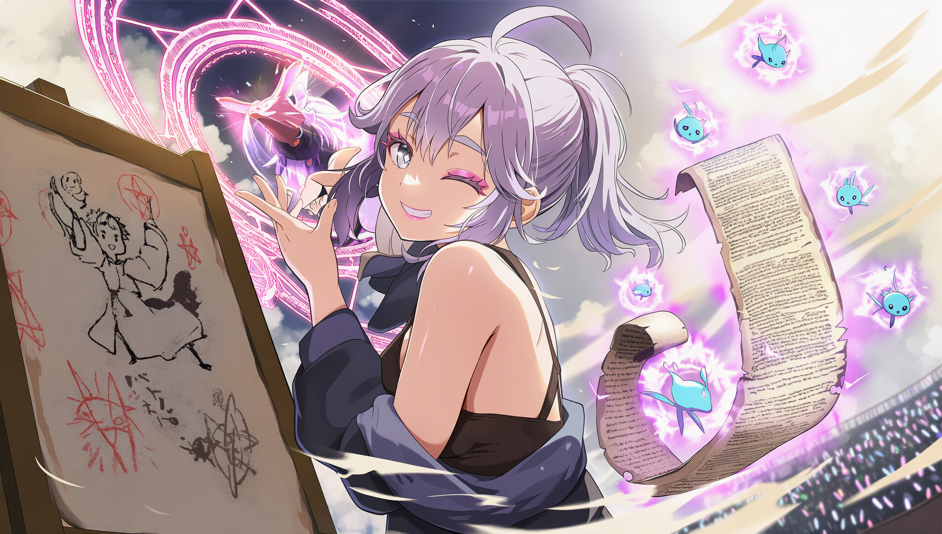
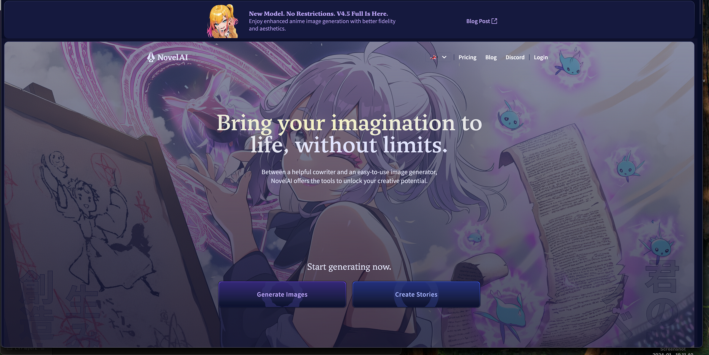
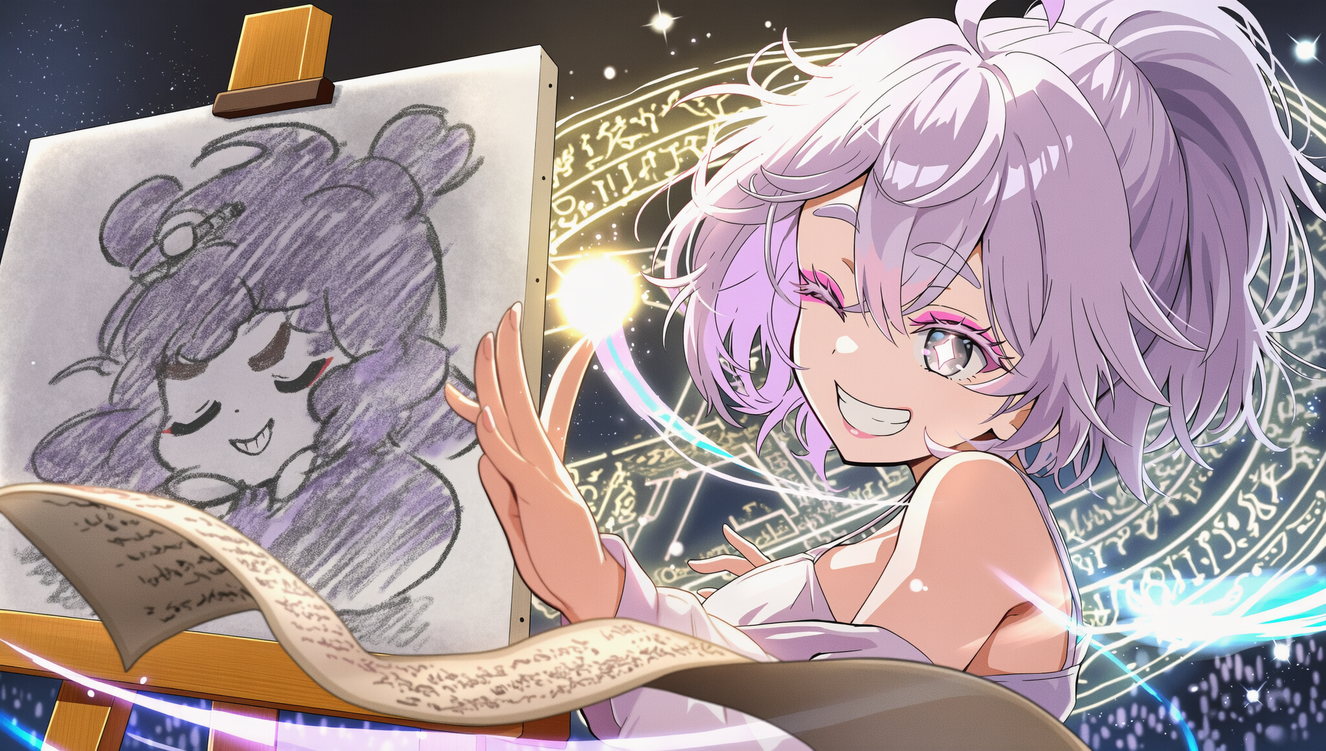
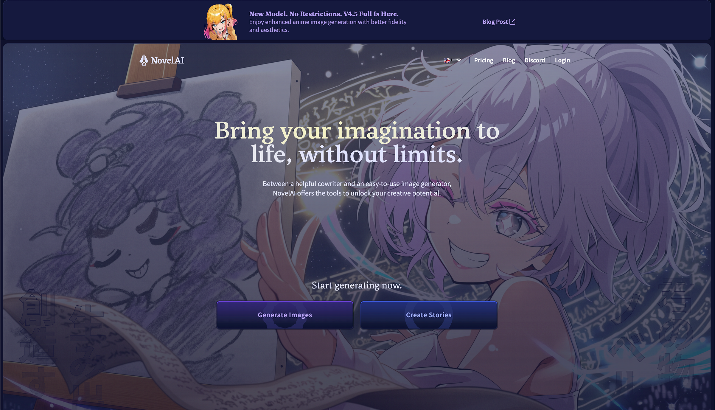
As you can see, using a big Nai-chan front and center wouldn’t quite work with our landing page copy or button placement. Additionally, using inpainting to fix up the text and paintings into orederly legible text or cute drawings/sketches without making use of our own product also proved a bit of a challenge. We had to rethink the concept from the ground up.
At this point during discussion we remembered the parallax effect that we used to create our novelai.net/links page. A flexible design that can be used on both mobile and desktop devices, friendly for any browser size!
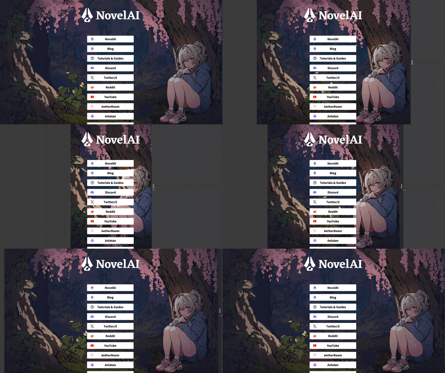
novelai.net/links in action!
This design consists of three assets, (tree (left), Nai-chan (right) and background trees) that adjust their position based on the available space, whilst featuring multiple generations created with NovelAI Diffusion.
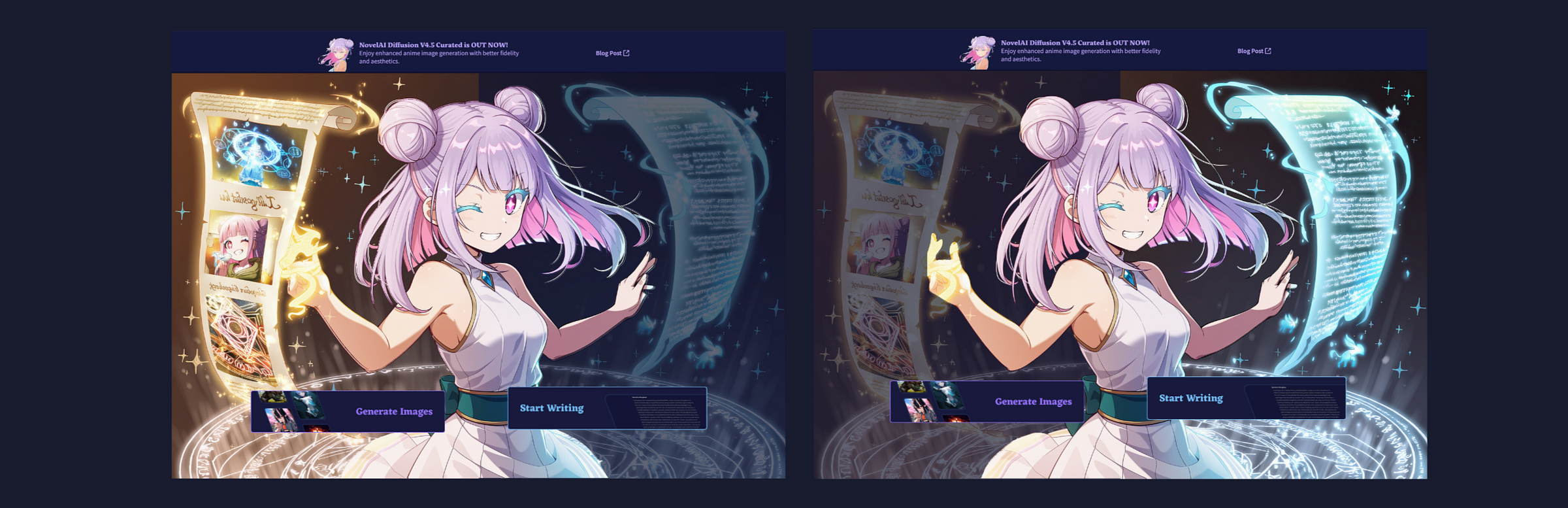
We still wanted to have one large character visible but the issue of visualizing text and painting in one large image generation that wouldn’t be covered up by text or buttons, highlight upon hover, as well as mobile sizing remained to be a challenge.
This is when we came up with the option to have each section, image & text, visualized through a character. The choices were clear as day, Nai-chan for image generation and our latest text-generation model character, Erato for text generation. We rolled with this idea and quickly had our first vision.
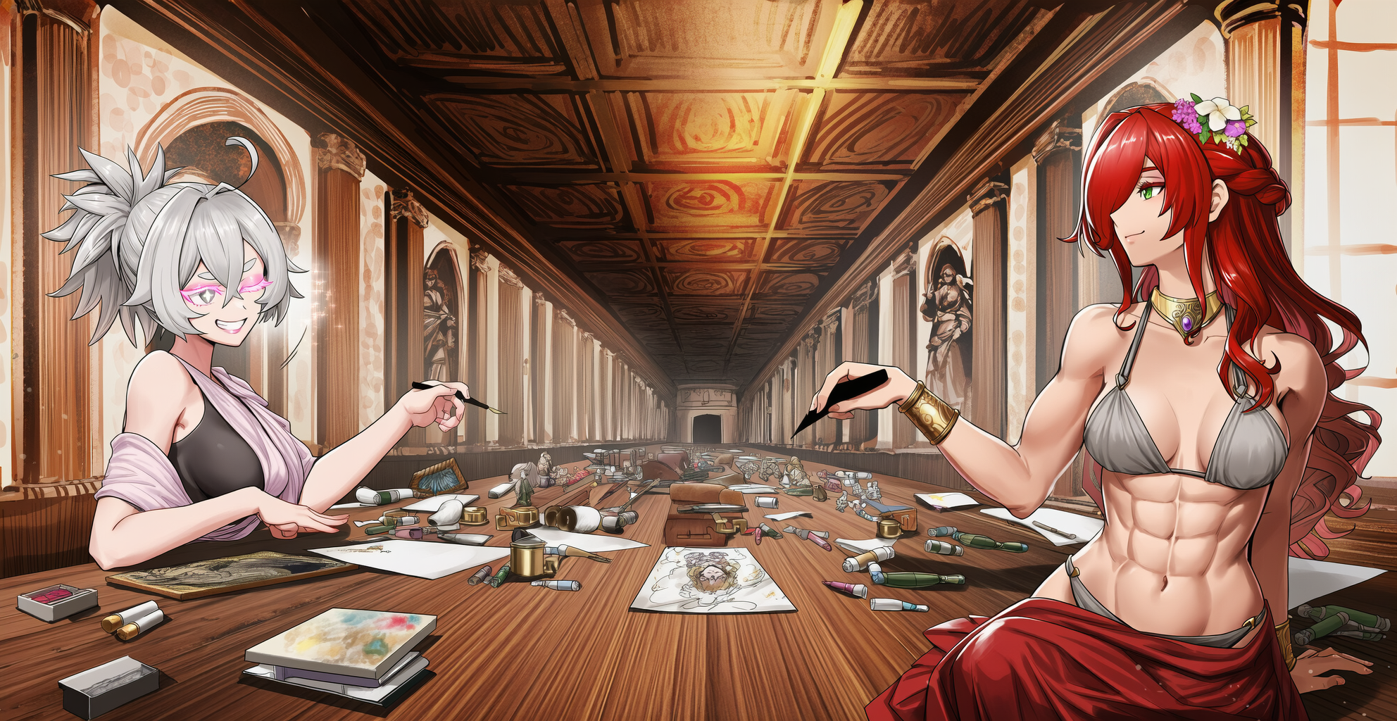
Initial draft
From here on out the process was easy!
For the style we used Vibe Transfer and an old hand-drawn asset we created for the Tokyo AI Festival booth in 2024.
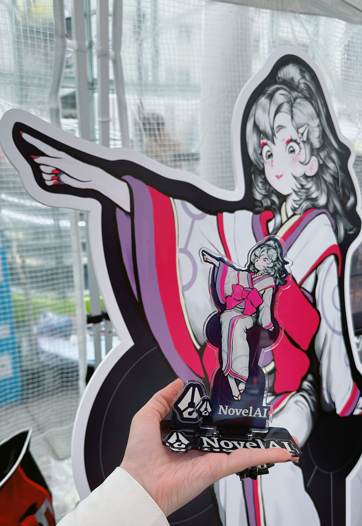
The asset in question, Nai-chan pointing at unlimited possibilities!
We regenerated the prompt and knew we were on the right track. The thicker outlines of the Vibe Transfer style make it easy to isolate any characters or items in an image, and the placement is nicely focused on both girls! You could almost go and use the generations without any changes — especially if you don’t need to isolate anything!
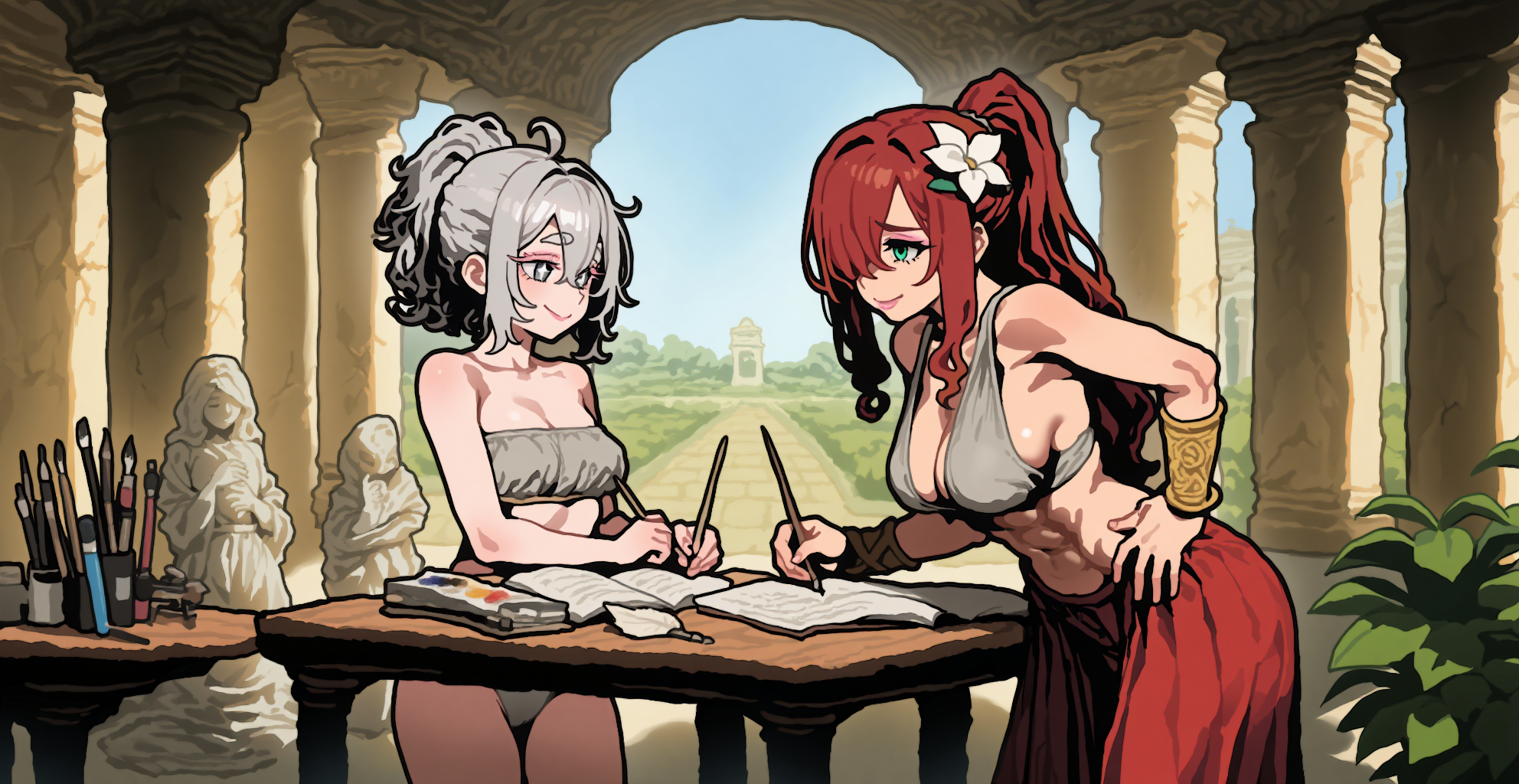
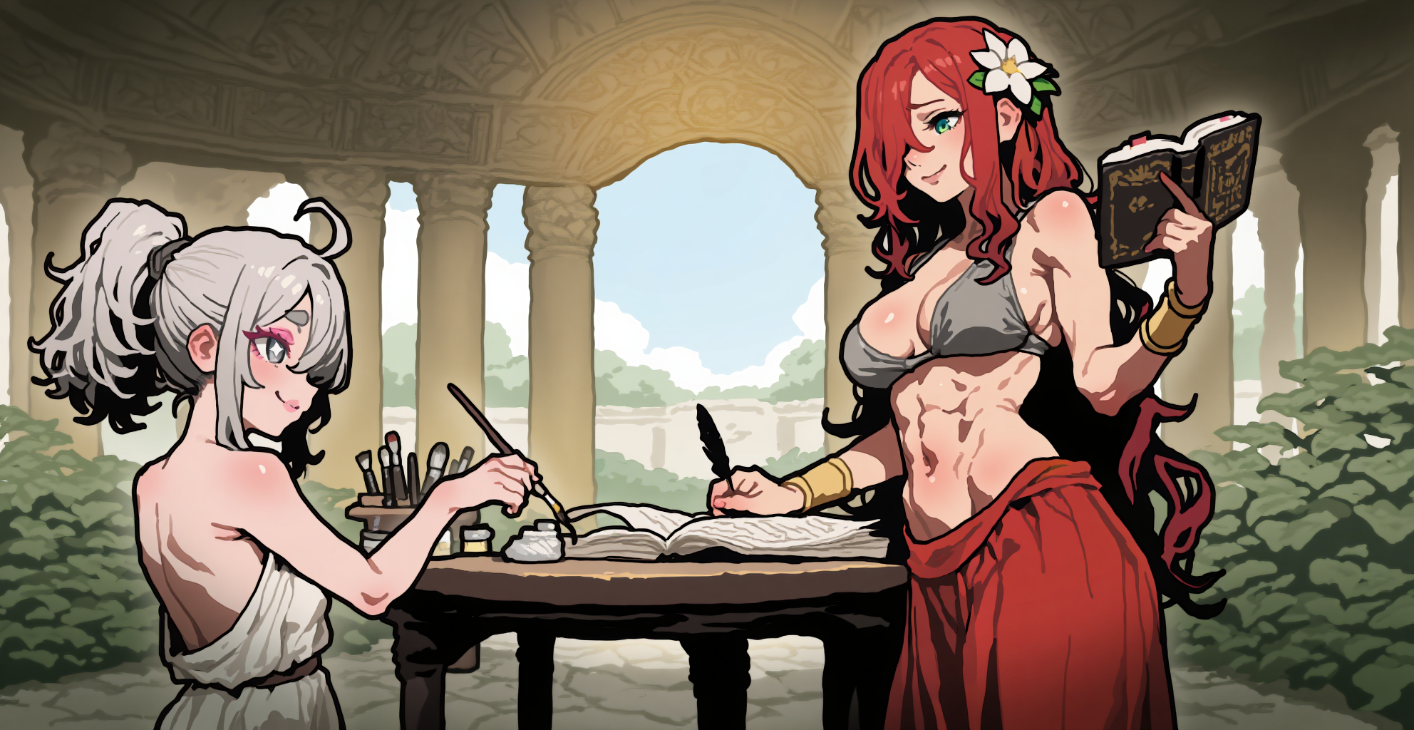
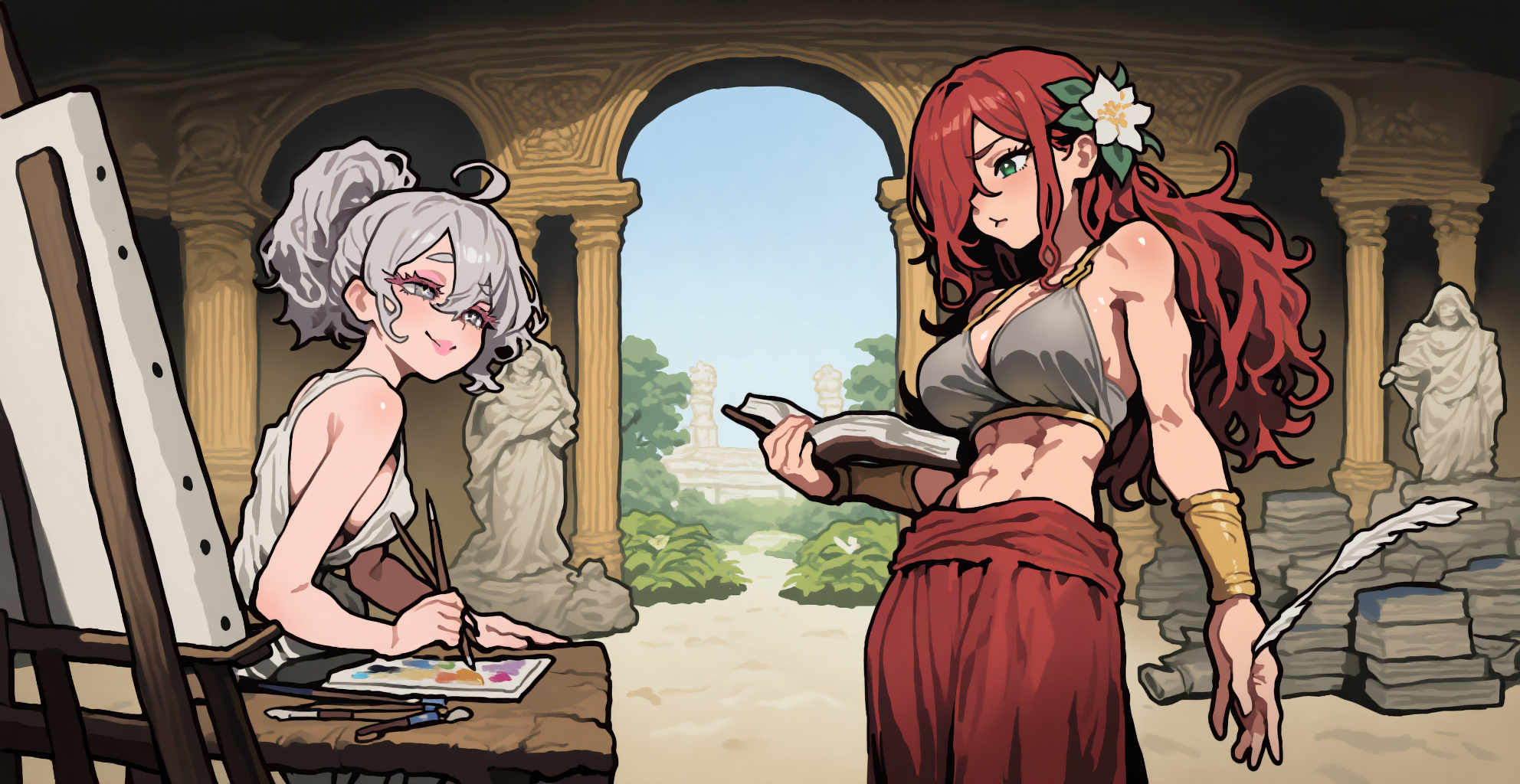
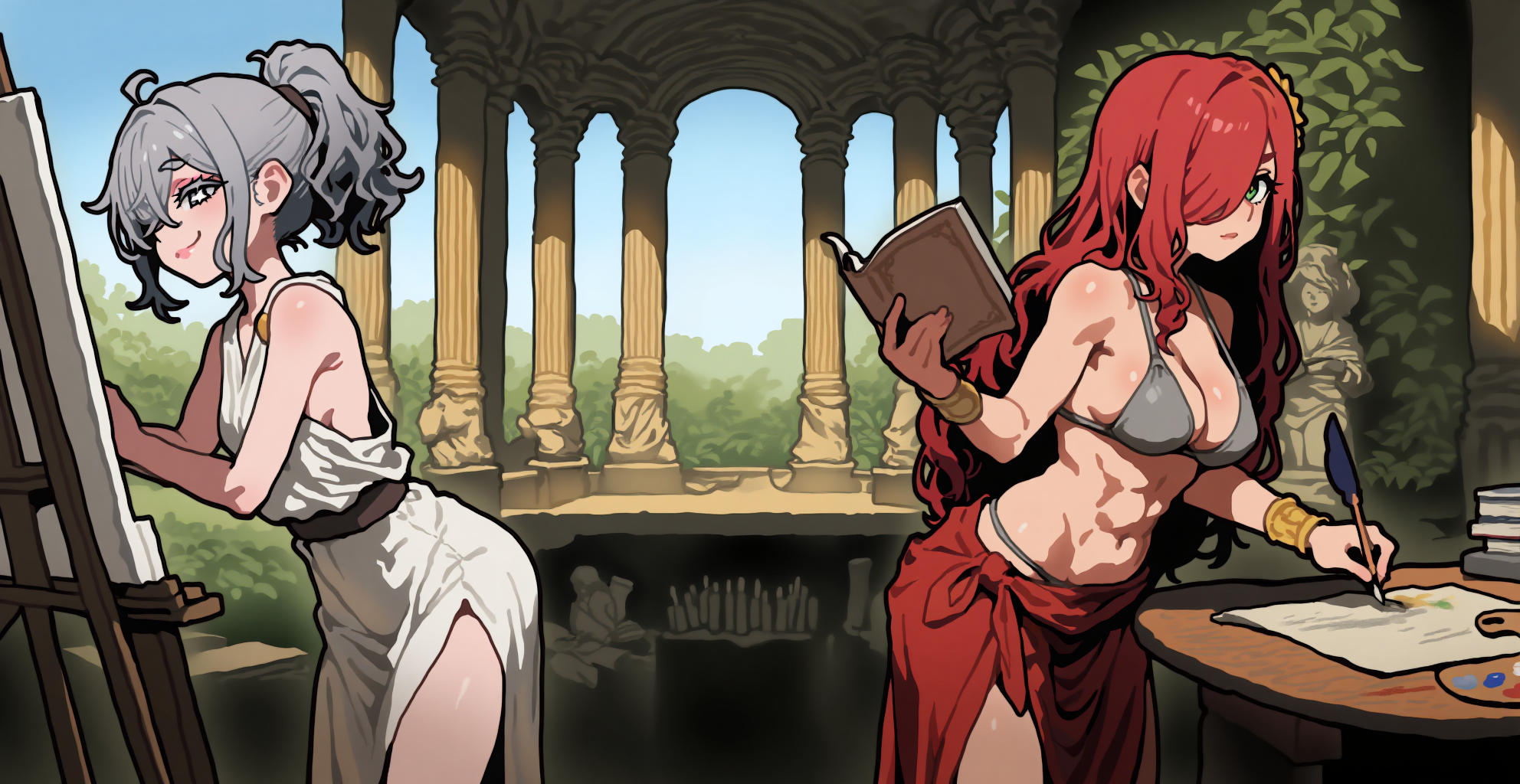
Final choice
Once happy with an iteration we needed to out-paint the image a bit so a larger resolution wouldn’t put the girls at the very edge of the screen. So we needed some additional materials for each girl, painting supplies and an expanded easel for Nai-chan, a table littered with inks, research and literary references for Erato.
A neat trick to generate transparent background assets — more of what you want, and not anything random: If you partially isolate areas that won’t be needed for the final asset anyway, the AI will not fill it in with random content and it will also keep the same style! Here we used the canvas to remove content around Erato’s outlines before generating and the AI expanded upon the decorative background and table.
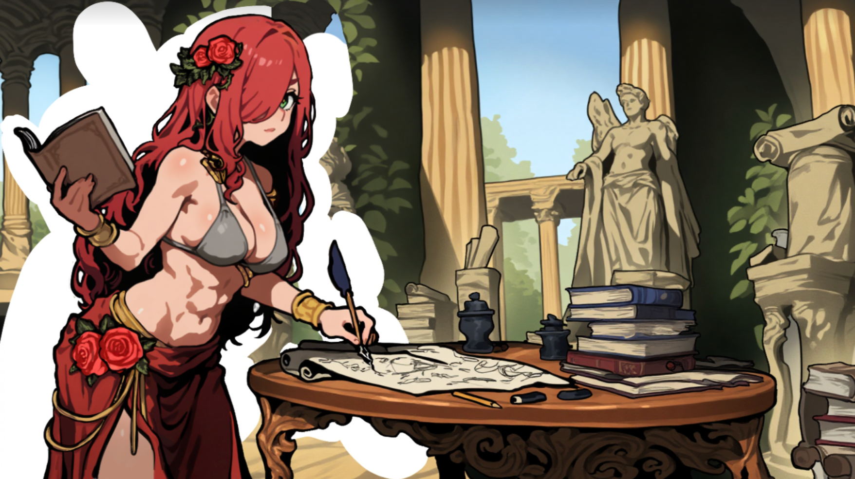
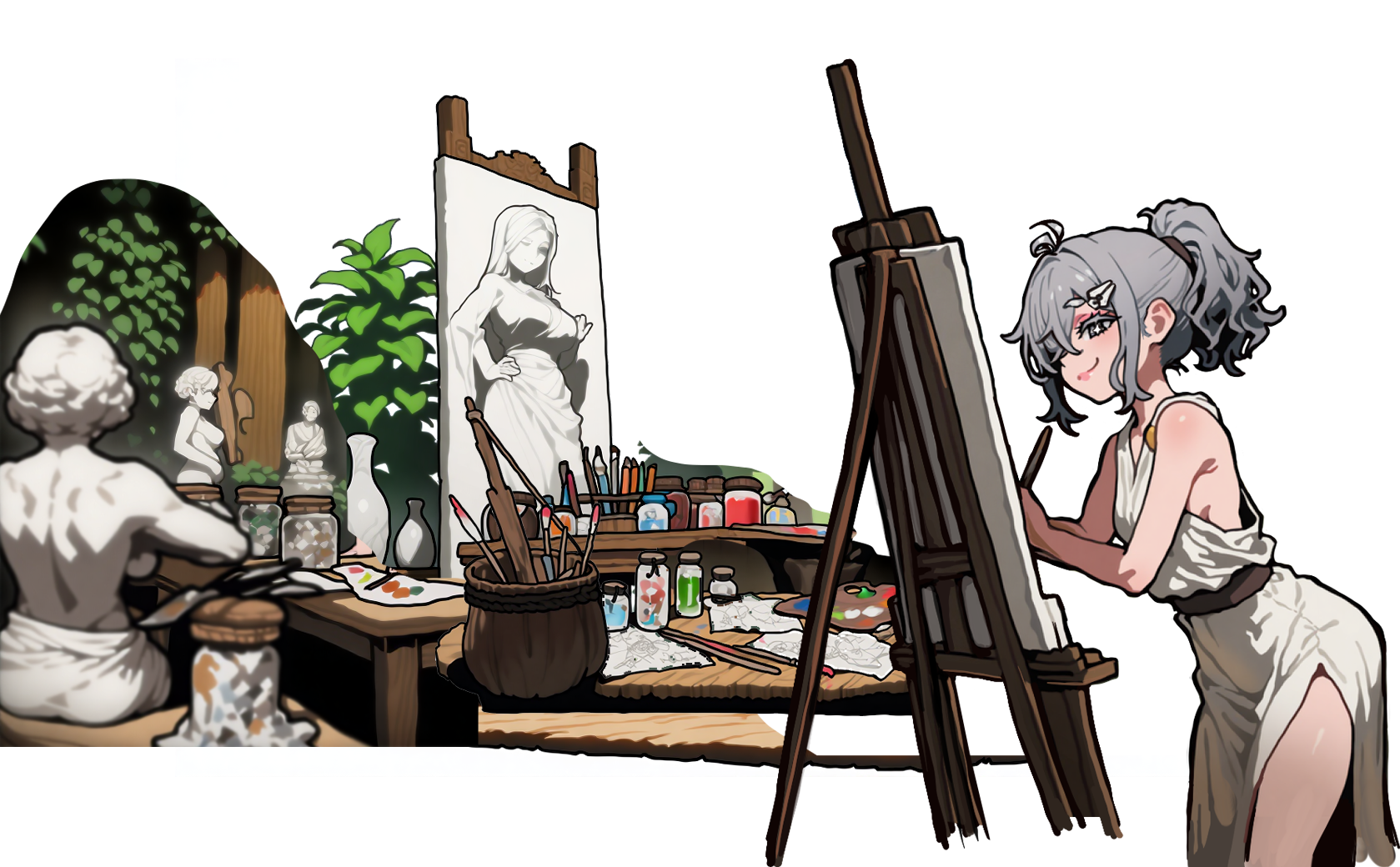
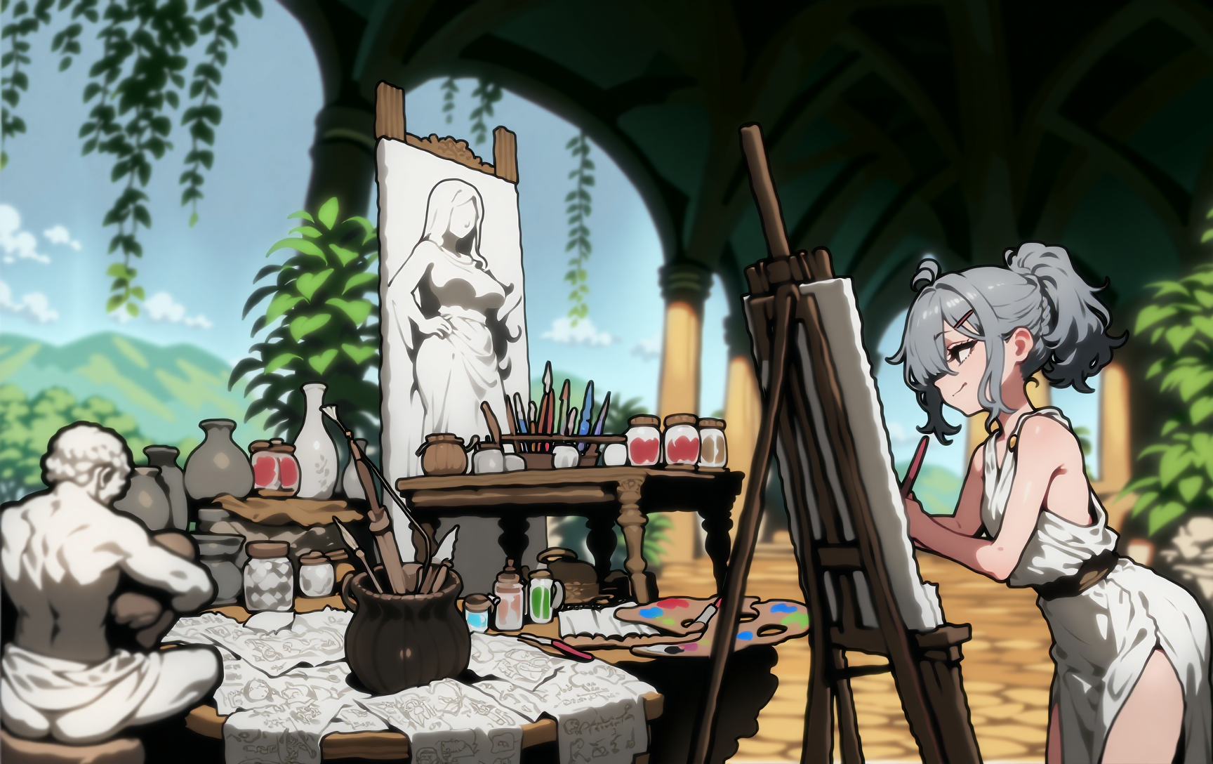
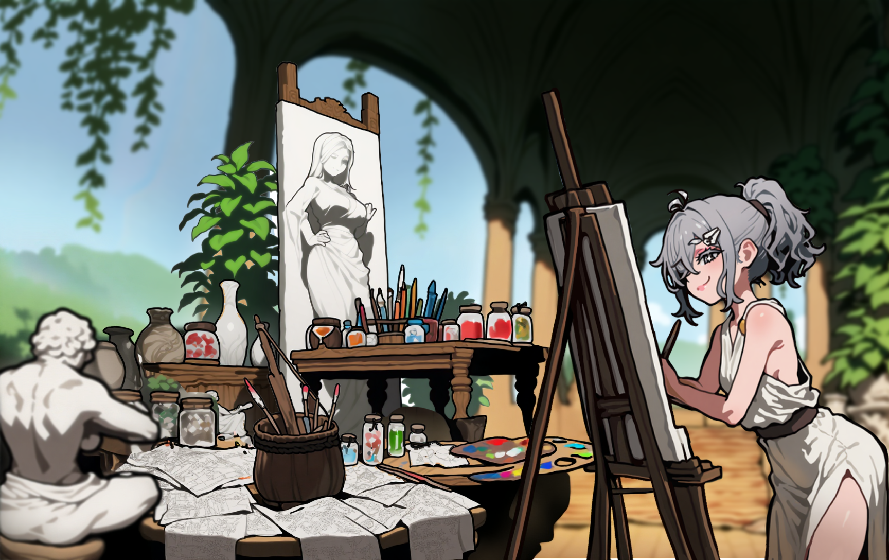
Then we isolated Nai-chan the same way, and combined some additional separate generations outside of NAI in Photoshop, before re-running it through Vibe Transfer. This guided the AI to come up with more pretty background items which featured the exact same visual style we aimed for, which it then combined into the same perspective with an img2img re-run.
Finally, the assets for the background materials:
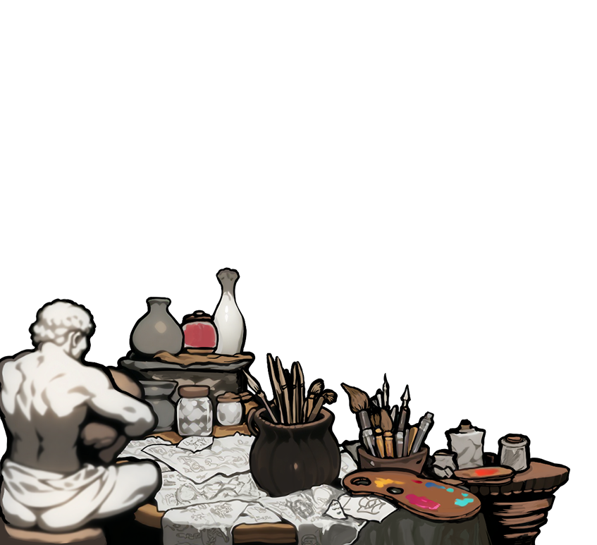
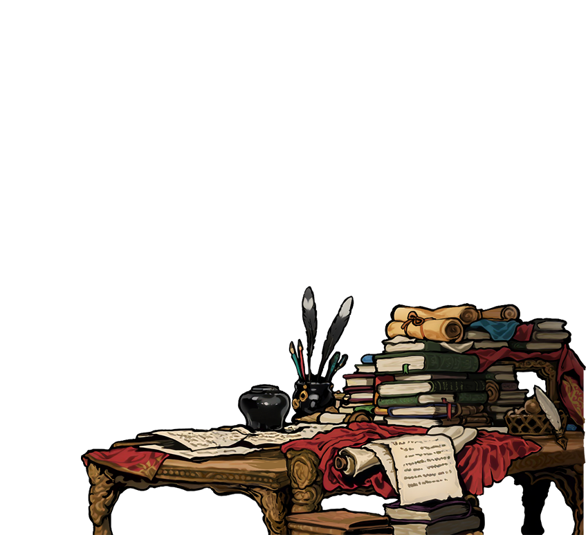
We isolated the girls in one easy Director Tools generation:
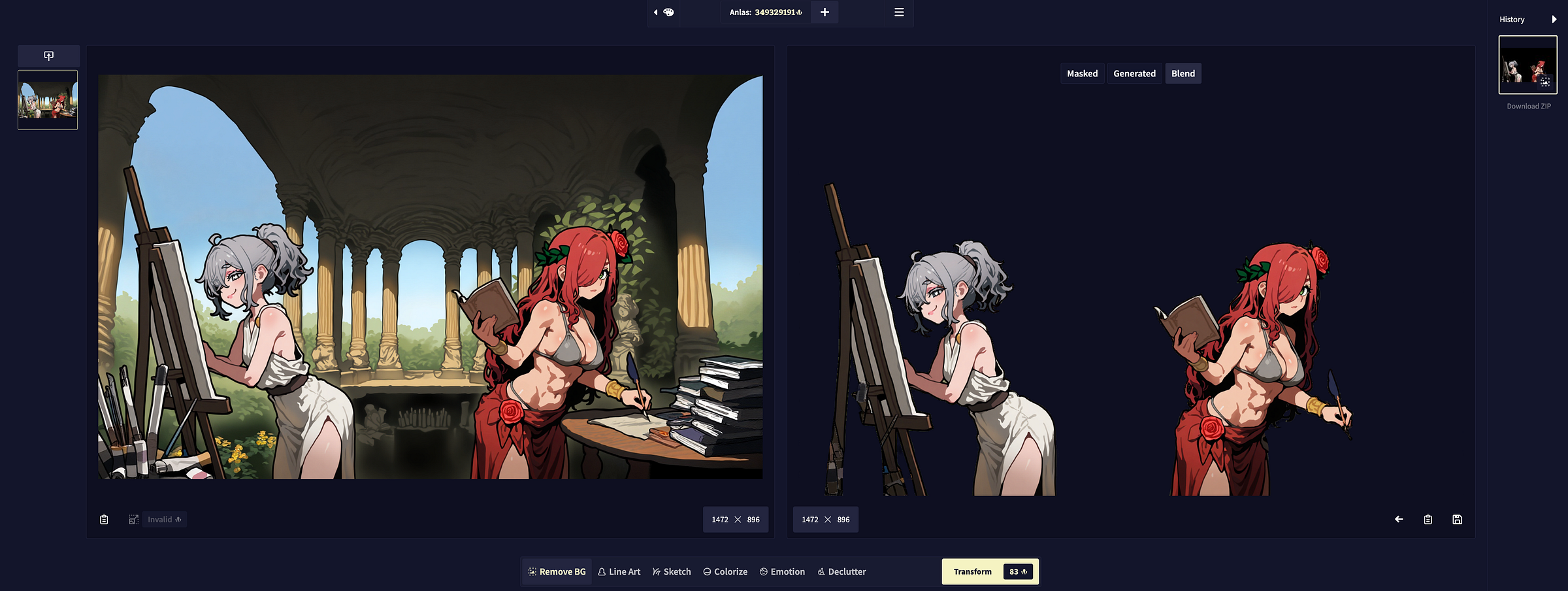
Our handy Director Tools remove a background in one click, which can save sooo much time!
Once isolated from the background, we went over each girl to refine them, and ensure they featured their NAI-logos & jewelry, also an urgent request/command for less cleavage came in from the big boss above (boo!), so we promptly followed that during this step as well.
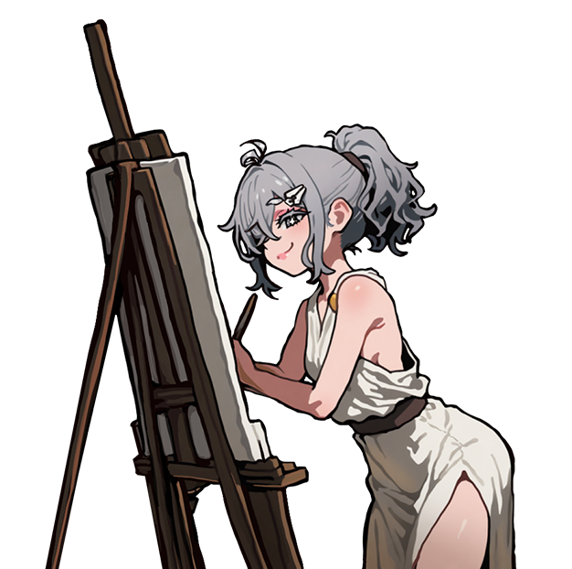
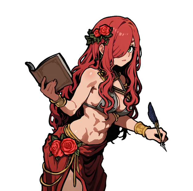
Last but not least, we inpainted the original background to remove any characters, and ran a few img2img generation requests with that as well, to gather some alternative options with the same feeling and visual style.
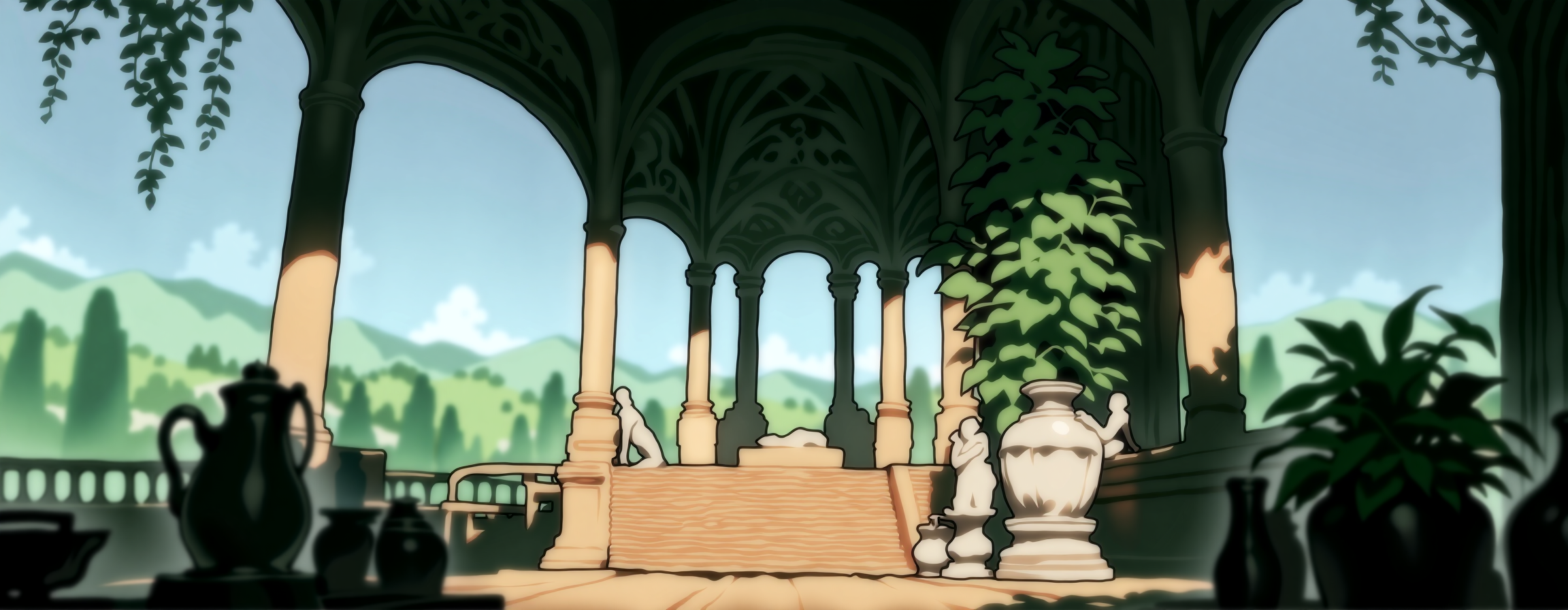
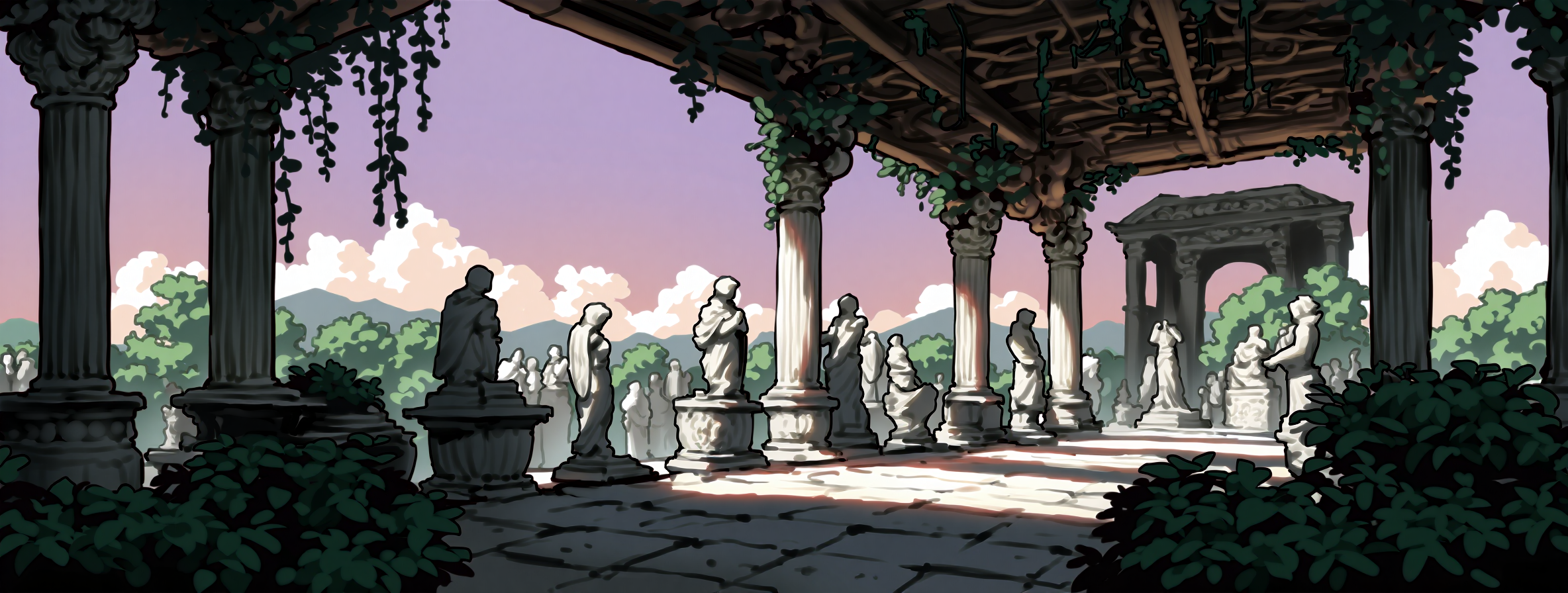
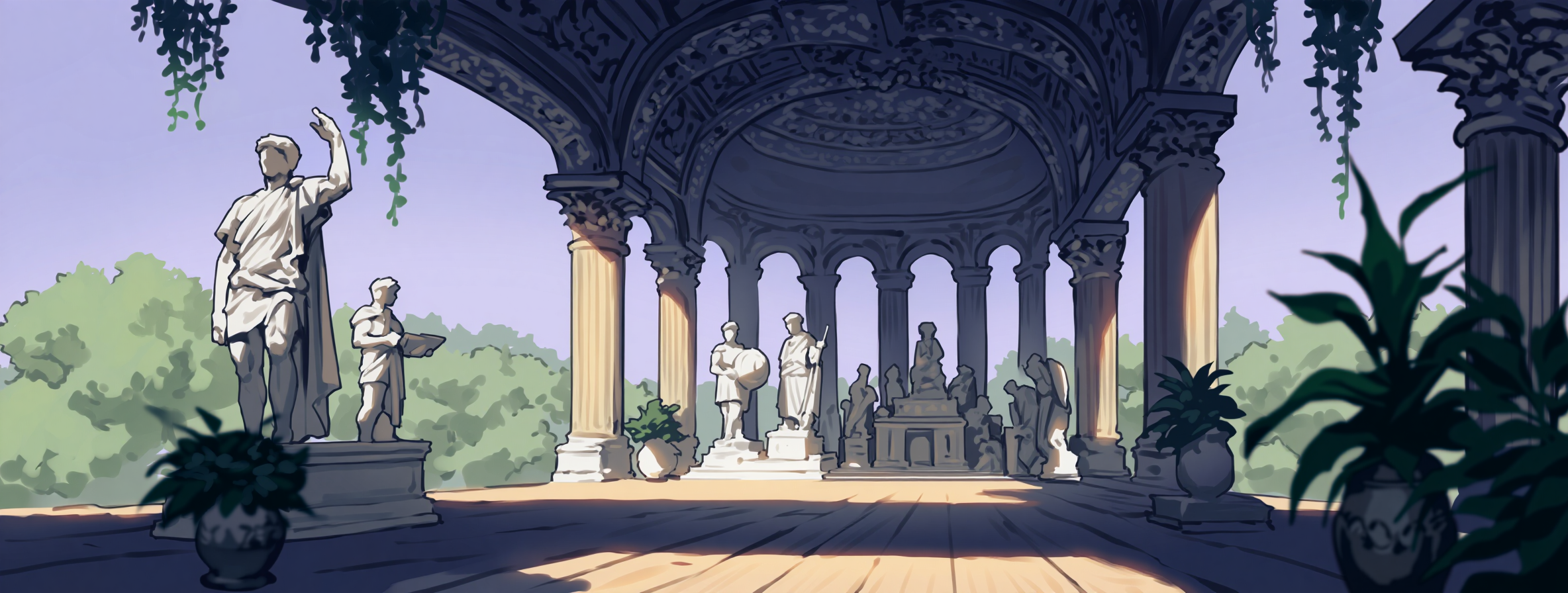
Finally the separate assets were handed over to frontend, and within a day we had the new Landing page, ready to be resized on any device!
To solve the issue that the girls would look a little strange on mobile when facing away from another, we decided to flip them and have them face another when the aspect ratio gets too tiny!
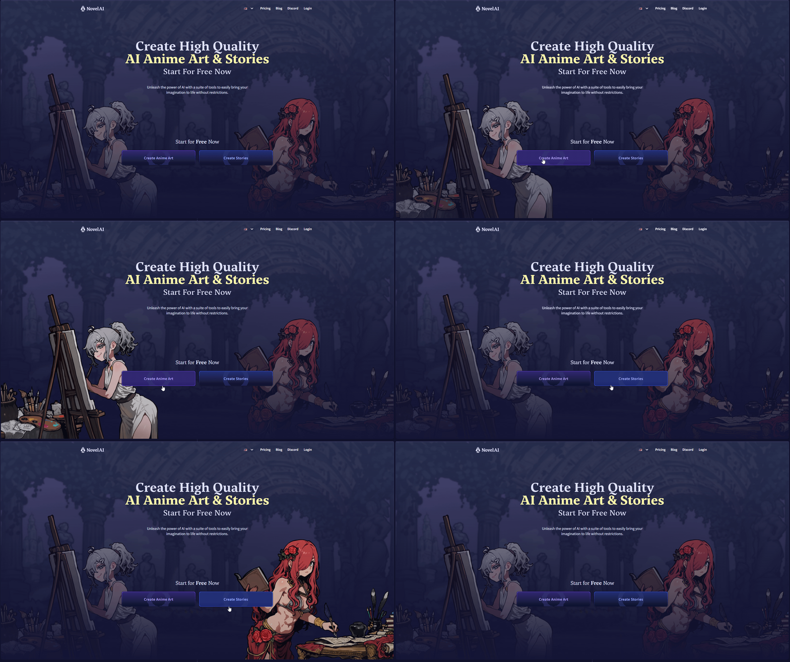
Another very neat aspect of having multiple separate assets for this type of project is that updating or swapping them out will be easy! We can simply churn up image generation again, and cook up the visual for the next text model to replace Erato! Alternatively, creating different versions such as a cyberpunk or medieval copy of the overall concept to bring back the vibe of “unlimited possibilities” would be a fun and easy project when the time allows!
The iterative process of creating, and adjusting assets used for this landing page can easily be applied to a litany of other fun projects. Imagine how fast you could create a visual novel or dating sim game like this!
Inpainting, Vibe Transfer and Director Tools can quickly help you adjust poses, change colors, create expressions, backgrounds and more.
All you need is an idea and some time to put it together, the possibilities are endless!
Have you created anything with our handy supply of tools yet?
Tag us on X or show us in our Discord so the team can marvel at your works!